If your company is still using static banner ads instead of HTML5 ads (Dynamic banner ads), then there’s a good chance that money is being left on the table. This is because a good portion of your target audience is not seeing your ad… even if it’s right there in front of their eyes.
How can you assure every website visitor is at least looking at your ad?
The answer is simple… make them move with Dynamic Ads!
Compare HTML5 banners with Digitaland 100% Free animation compare tool – Click here!
The Cure to Banner Blindness
High impact HTML5 ads are proven to attract more traffic to websites than standard static banner ads. A study by Adform showed that clickthrough rates of rich media ads are 267% greater than those from static ads. This is because a website visitor may never even glance at a static banner, but movement is almost psychologically impossible for the eyes to ignore. Animated banner ads are the wiser investment because they assure people are actually viewing your ads.
Users can also be exposed to a greater amount of content with HTML5 ads (High impact creative), all without ever leaving the publisher’s site. For example, instead of relying on just a headline to spark interest, you can now dive deeper showing more benefits to entice users even further to clickthrough to your website.
Engagement leads to brand awareness and brand recall. The brain remembers things we interacted with much better than things we only viewed.
Endless Possibilities… Where to Start?
Now that you aren’t stuck to a single, static image, it’s easy to become a little overwhelmed. Where should you start? What techniques have worked for other brands?
Below, we’ll take a look at five HTML5 ads that will jump start your brainstorming session:
Five Example Of Great HTML5 Ads – High impact units
1. Major League Soccer
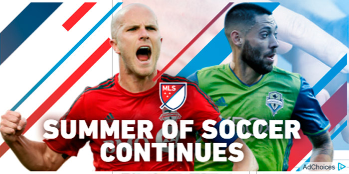
This animated banner made by Undertone users cannot miss. The animation is bold and eye-catching to attract soccer fans. The background is transparent, making it feel less interruptive, almost like it is just a natural part of the site. The ad very briefly shows a quick animation to draw your eye, then shrinks to a tiny rectangle on the side of the screen that shows an image of a soccer player. The ad is just enough to grab a soccer fan’s curiosity, without being invasive to someone who isn’t interested. When a soccer fan clicks on the tiny rectangle of a soccer player, it widens to a bigger screen showing a quick clip of an audience cheering with the words “Stand in Awe,” giving the soccer fan the familiar thrill of watching the games. It then provides a link to view the game schedule.
Tip: Try to think of how you can utilize a transparent background as a way of standing out. Can you catch attention without blocking the content on the site? Also try to think of what kind of images would quickly grab the attention of your target audience.
2. Nike Free by Digitaland
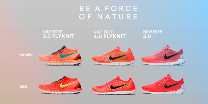
With a beautiful video, intriguing copy, and a rich user experience, this animated banner speaks for itself. The ad starts with an inspiring video of the Kenyan National Team running on a trail through gorgeous hills. In case a user is wondering more about those super cool orange running shoes they’re wearing, then once the video is over, they can browse through the collection of shoes. The ad becomes somewhat of a minisite where users can click shoes to get a closer look at the features, such as a close up image of the hexagonal flex groove at the bottom of the shoe. We also like the fact that it’s a cross screen banner, which means the ad works across both desktop and mobile screens. This ad had over 50K views, an interaction rate of 47%, and a clickthrough rate of 22.3%. If you’re interested in reading more about how we created this ad, then take a look at our blog article here.
Tip: Try to think of a way you can start the HTML5 Ads with a short video of someone using your product, and then display the product right there for the user to get a closer look at your product without needing to click through to your website. A user is much more encouraged to view a product that’s right there in front of them.
3. Microsoft Band
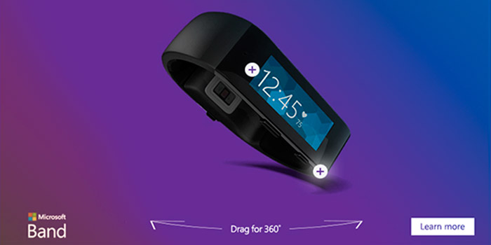
Why do people like to go to physical stores to do a lot of their shopping? So they can get a hands on look at the product. The next best thing is an ad that features a 360 parallax, like this one for Microsoft Band. It starts as a thin banner with a simple headline: “Live healthier and be more productive.” Once someone scrolls their mouse over the ad, the ad widens to invite them to examine the Microsoft Band. Users are able to spin the wristband around and see all angles of it in any direction they like.
Tip: Write a compelling headline to arouse curiosity, and display your product right there in the ad for users to see and explore with a 360 parallax.
4. H&M
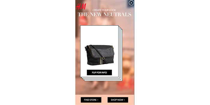
We like the H&M banner made by Kargo because of the multiple opportunities the user has to interact with the ad. The ads starts at the bottom of a mobile screen with a headline that invites users to “find their look.” When a user taps on the thin banner, the ad opens to full screen revealing a quick guide on how to explore the ad. The user can browse the catalog by swiping through products like a deck of cards. When they see a product they like, they can flip the card over and read more details such as the price and a short description. The user has the option to clickthrough to the H&M website to purchase the item and/or find a store near them. There’s even a “Pin it!” button so the user can pin their favorites to Pinterest.
Tip: Try to think of ways users can share your product to social media straight from the HTML5 Ad.
5. Bancomer
HTML5 Example #5
This 3D animated banner takes a humorous approach to auto insurance. What can protect your car better than a force shield, rocket missiles, a fire breathing dragon, and a giant chainsaw? The ad parodies a car shop and has the message “Choose Your Protection” floating overhead. After that, users can choose which deadly add-on to give the car. This was a fun creative concept that we were thrilled to develop. You can read more about our experience creating this ad here.
Tip: They turned the idea of protecting your car into literally transforming your car as if it’s ready to go into battle. Try asking yourself if there’s a way to turn your brand’s message into a metaphor to make your brand more memorable.
Got Some Ideas Rolling? Digital creative agency want to hear from you!
Hopefully these suggestions have turned a light bulb on in your head. Did any of these ads inspire you to come up with a new angle for your ad? Do you have more examples of creative HTML5 ads to share? Let us know in the comments!




4 Replies to this post
Do you have an example of HTML5 for a company that markets alcoholic drinks?
Great post about Html5 ads..I think that Its very important to companies to talk about this Blindness.
How do you actually upload such ads to social media?
Amazing post.. a lot of information about html5 ads thanks!