It’s been a pharma marketer’s learning frenzy around here lately. We’ve tackled how to find the right digital production partner for your pharma banner ads, the cure for boring pharma banner ads, tips to make your pharma banner ads more creative and more.
And it’s all great information. But sometimes you just want to see a shortlist of do’s and don’ts, along with a breakdown of the best (or worst) Healthcare Banner ads out there.
So that’s what today’s post is all about. We’ll look at some real-world examples of what you should and shouldn’t do when building your pharma banner ads.
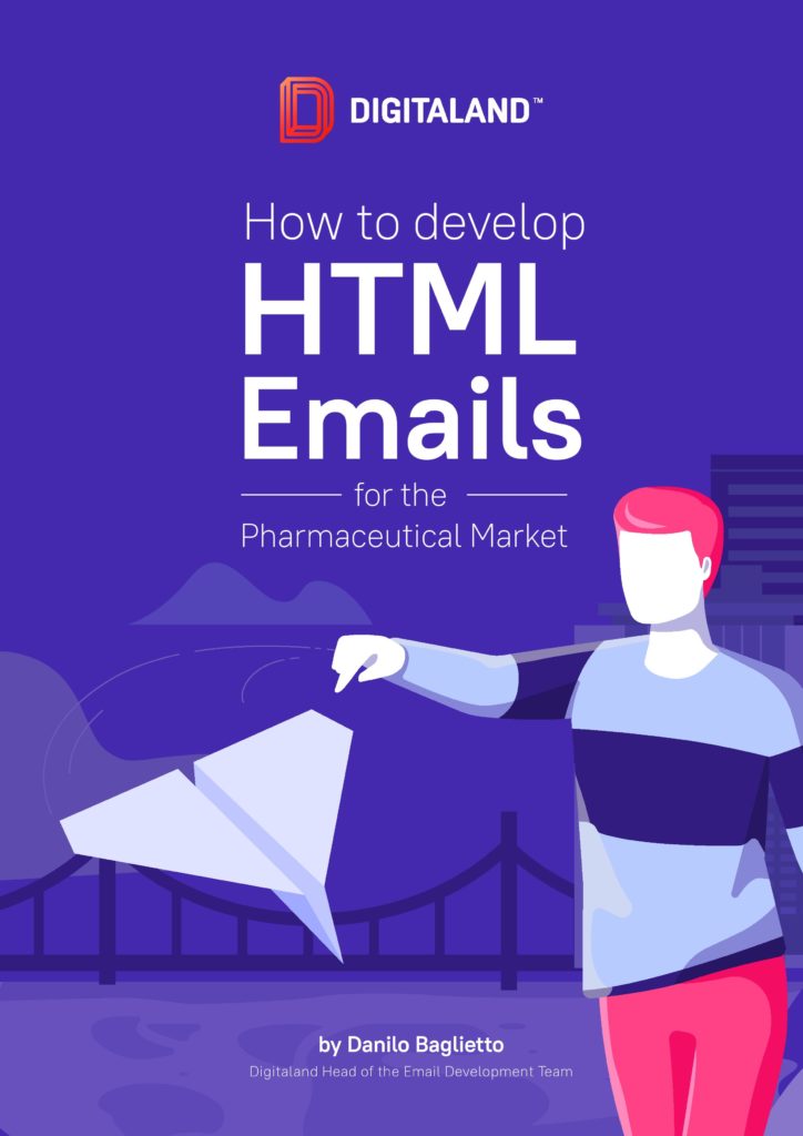
How To Develop HTML Emails For The Pharmaceutical Market – FREE EBOOK
DON’T trade clarity for cleverness
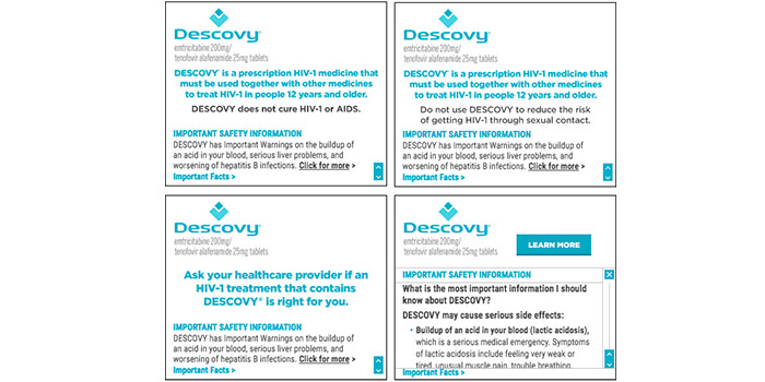
Look at the first four frames for this ad. Can you tell what it’s for?
- Suicide awareness
- Gut health
- HIV-1 medication
If you chose C, you’re right. But, it’s not until the small print on the fifth frame that viewers even know what the ad is for. They’re forced to comb through a wall of text for the answer.
And that’s assuming you kept their attention for that long.
Healthcare Banners
The problem: the first four frames don’t tie into the medication being marketed. Not even a little bit. The viewer is asked to make a leap from “Love what’s inside” to pharma-talk about a prescription HIV-1 medication.
We believe in the power of creative for building amazing pharma banner ads. Done right, creative, witty or heartfelt messaging can be a great way to grab attention and keep viewers interested. But when you opt for clever over clarity, and fail to tie your messaging to your offering, potential viewers tune out.
DON’T forget to deliver on your landing page
High Quality Banners
Ever heard the saying “After a wedding comes a marriage”? Well, after a banner ad click comes an expectation: did you deliver on what your ad promised? If so, you have a chance to build engagement and positive brand awareness with the viewer. If not, you risk creating a negative brand association.
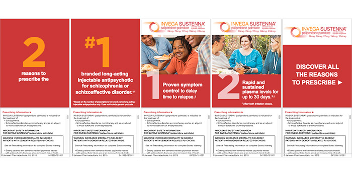
Case in point:
This Invega ad invites you to ‘discover all the reasons to prescribe.’ But, clicking through leads to a landing page that presents two indications to choose from, without any additional call to action or explanation tying back to the Healthcare Banners. Only after (or if) the viewer makes a selection do they finally arrive at the promised information.

High impact creative
Trust, time and attention are your audience’s most valuable assets. When they click on one of your pharma banner ads, they’re going out on a limb and trusting you to deliver what was promised.
Don’t give them a reason to distrust your brand. Never make promises you won’t keep, especially in a Healthcare Banner ads campaign. Want to keep things simple? Ask your digital production partner build your banner ads AND your landing pages.
DO get to the point
Digital creative agency
The best way to respect your viewer’s time and attention? Lead your pharma banner ads with what matters to your target audience.
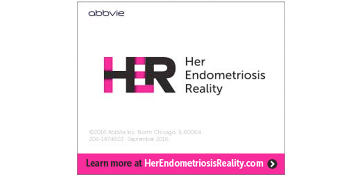
Sometimes that’s as simple as spelling it out, like this unbranded Abbvie pharma banner ad does for its target audience: healthcare practitioners who work with female patients that have endometriosis.
Abbvie’s ad is proof that with the right digital production team, you don’t need a ton of creative assets to build out an attention-grabbing pharma banner ad.
The ad is visually compelling and simple. There’s no distracting clutter and the bold color combination paired with the white space catches the eye, drawing it down to the call to action.
DO use compelling visuals
Digital Banner Production
A picture is worth a thousand words. And on a pharma banner ad, where space is at a premium, imagery that can do double duty as a messaging tool is worth every pixel.
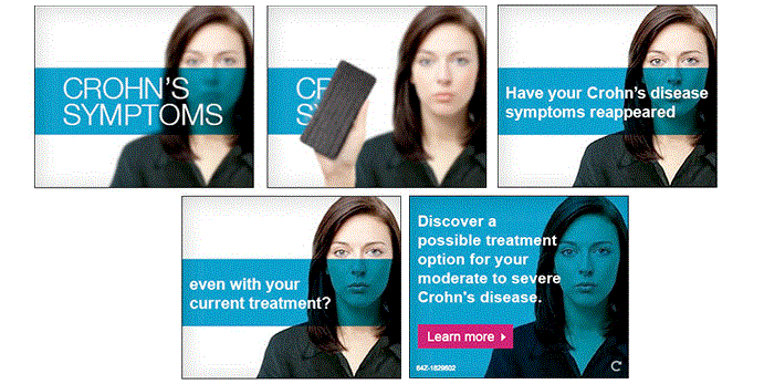
This unbranded banner ad for Humira hits all the right notes with simple but impactful visuals that help move the messaging forward. It’s a great example that less can be more.
The copy, images and clever use of animation work together to draw the viewer to a compelling value proposition (‘Discover a possible treatment option’) and a clear call to action (‘Learn more’ accompanied by an arrow to prompt action).
The replay button is a nice, subtle touch for viewers who want to rewatch the ad. If you’re thinking of using animation or multiple frames, ask your digital production partner about adding a replay option.
***
Ready to make you pharma banners ads worthy of the ‘Best Of’ list? Drop us a line!