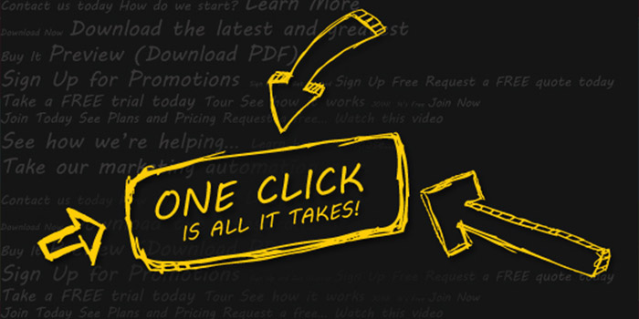
When it comes to rich media ads, success isn’t just defined by user engagement. Getting a user to act is what ultimately drives success. To do that you need call to action buttons that really grab a user’s attention and demand immediate action. The following CTA best practices can be applied to all rich media ads to increase click-through rates and ensure better ROI.
CTA best practices at a glance
All rich media banners should contain both the client logo and a CTA. Best practices suggest keeping the CTA button on the left side of the banner.
Calls to action should be short and direct. Phrases like Act Now and Save a Life are good because a user has no confusion on what is being asked. You need to always be clear with your CTAs to increase response.
Rich media banner ads: Size matters
The placement and size of your CTA buttons should have more prominence than other elements in your rich media ads. Size is the number one way to catch attention and convey importance to a user. If you have more than one CTA button, then vary their sizes depending on their importance.
However, don’t overdo it. Don’t have too many buttons or too much clutter. CTA best practices indicate that you should have no more than two actionable buttons on a page, and to keep the design simple. That being said, let’s look at this point a little deeper.
Simplicity matters, too
Keep your rich media ads simple and easy to navigate so that you don’t lose users along the way. It is better to guide users through the experience than to pound them over the head with too many choices.
What about CTA best practices regarding color?
To really stand out in your rich media ads, your CTA button colors need to really contrast from the background and other elements on the page. Button colors should contrast from background elements to stand out. Remember, with rich media your CTAs are often in competition with other engaging elements likes animation, video and scrolling galleries. So it’s important to be sure your buttons stand out and compel users to tap them.
Good call to action examples
That’s a good question. And one that has been tested time and again. Here are a few clear, direct and effective examples of good CTAs:
- Tap to Learn More
- Tap to Expand
- Tap to Help
- Pin it
- Pin on Pinterest
- Like This
- Share
- Tap to Tweet
- View Gallery, and more
As you can see, each of these use CTA best practices to clearly convey the action you want users to take.
Remember, you want your ads to be engaging and fun, but ultimately you want the CTA button to be the hero that drives action.